
Problem: It is Historic Preservation Month you are on a walking tour through our city. The tour guide aks that the group follow along with the slides on your phone to view historic photos of the locations you will be visiting. Only a desktop version of the website is available and it is organized in such a way that tour information is impossible to find on the go.
Objective: To improve the guided tour user experience by creating a easy to navigate tour selection screen and giving the site a streamline and modern interface on mobile devices.
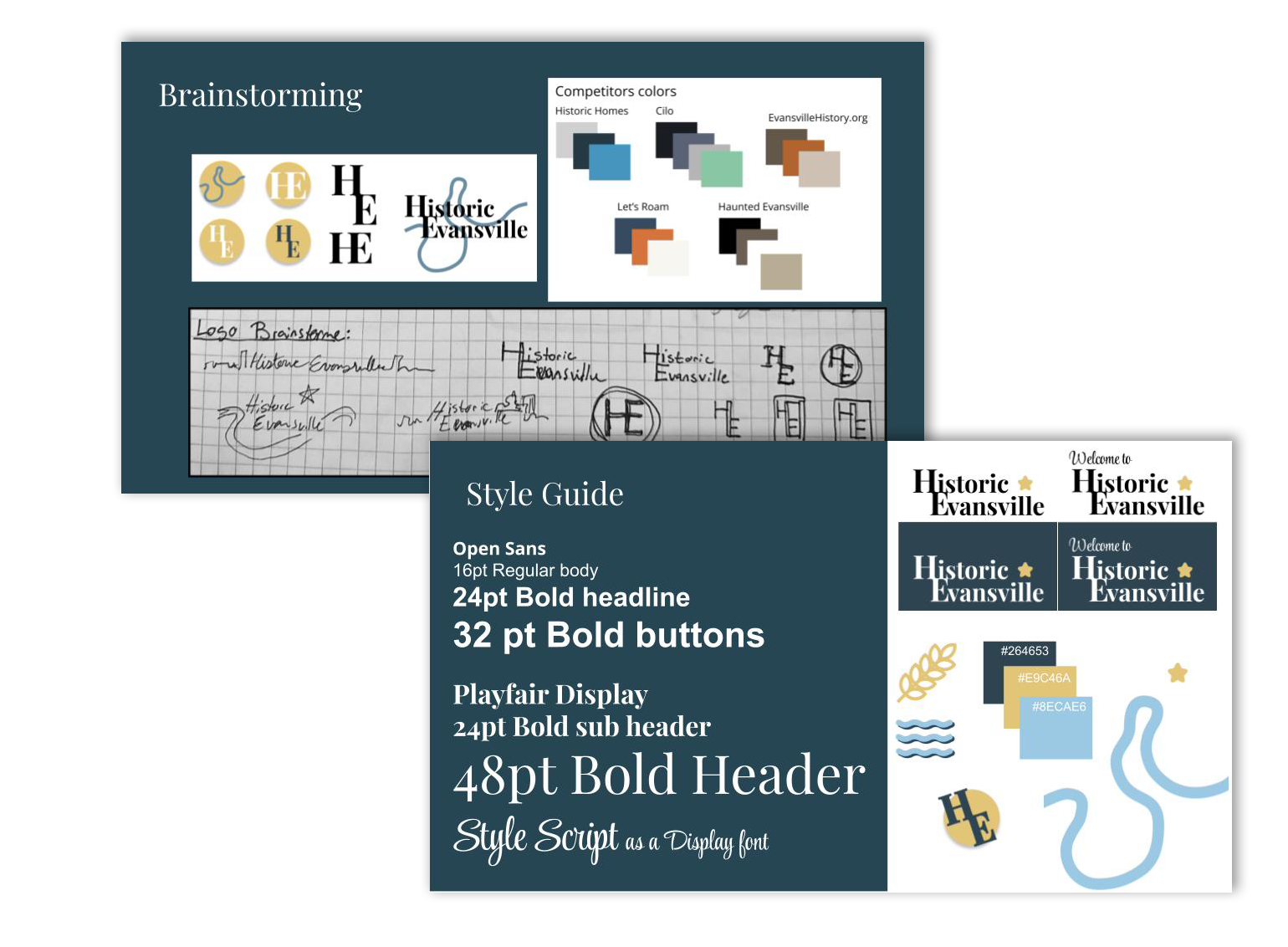
Research & Developing a Persona:
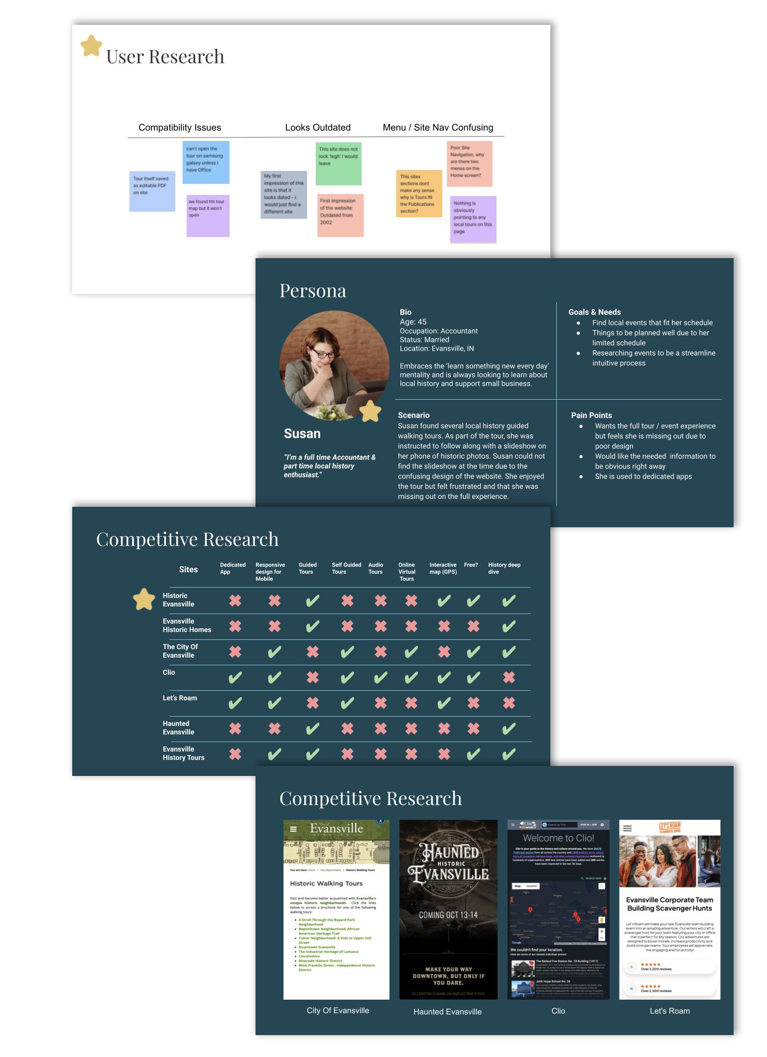
I interviewed 9 people a between the ages of 26-62. During my interviews I found most Users want a curated interactive experience and don’t want to do a lot of work on what is supposed to be a fun event.
The main issues that kept popping during the interviews were: confusing menu design, outdated UI made the site feel untrustworthy, and device compatibility issues.
With the information from my interviews I created a persona. She wants to learn more about local history and stay active as she is behind a desk most of the day. She wants clear directions when using app or web portal to look up information and needs events to be planned well due to her limited schedule.
With the information from my interviews I created a persona. She wants to learn more about local history and stay active as she is behind a desk most of the day. She wants clear directions when using app or web portal to look up information and needs events to be planned well due to her limited schedule.
User Goals:
Modern Design: Users don’t trust a site with an outdated UI or a design that behaves differently than expected
Ease of use: Straightforward navigation that leads to the relevant information, no one wants to dig for information that should be a menu item
Scheduling and accessibility: A way to see upcoming tour dates, length of tour, and how much walking will be done and if there will be opportunities to sit
Feature Prioritization:
Now:
• Homepage redesign
• Resolve issues with navigation
• Retooling of Menu Items/categories
• Update site UI
Next:
• Re-organize layout of history info on site for better educational flow
• Add a pop up / quick facts option
• Update Interactive GPS map feature to use while walking
Later:
• Add Audio tour options
• Add fully self-guided option
• Barcode scan to start tour for more feature
• Scavenger hunt feature
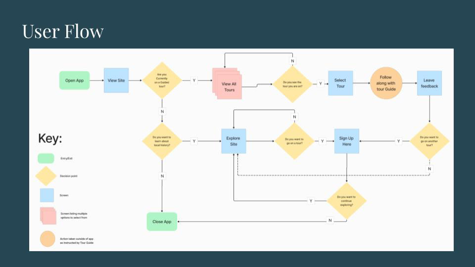
User Flow & Key Screens:
This is the ideal happy path for the user going to the site, finding their selected tour, leaving a review and signing up for an additional tour or continuing to explore the site.
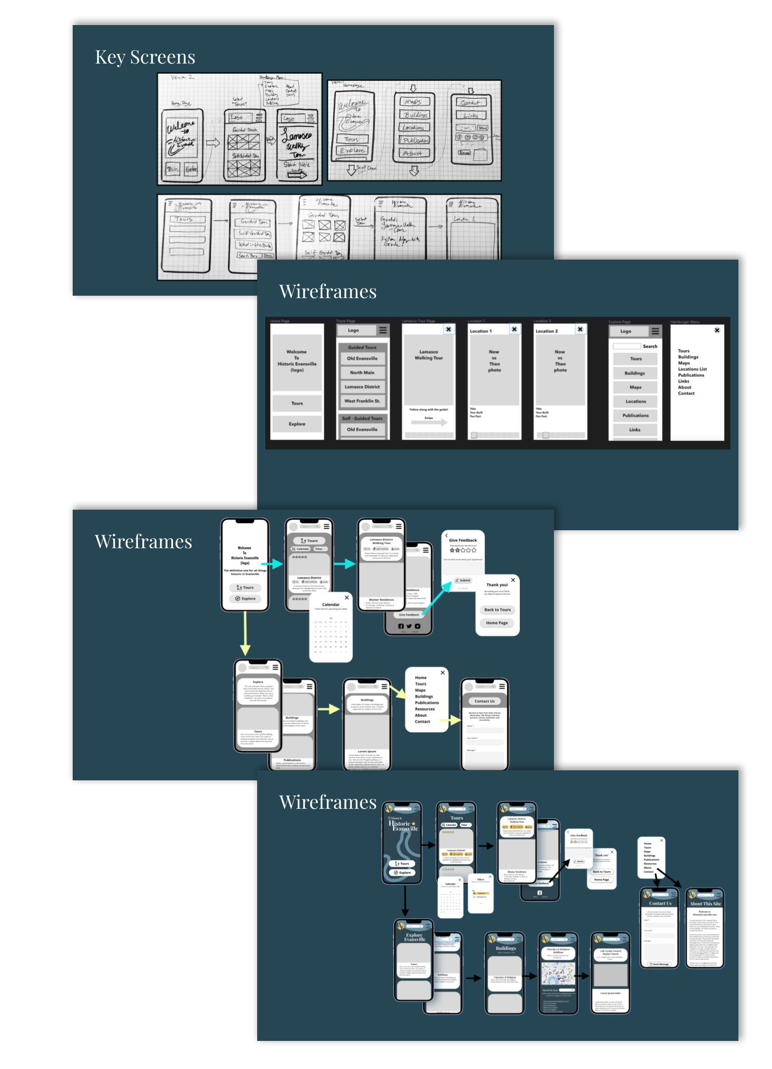
I then sketched out my key screens, low fidelity wireframes, I ended up with several iterations while figuring out the flow - I ended up adding quite a bit with each version of my wireframes as I got feedback and did some user testing and ended up changing several UI design elements along the way.
User Testing:
Before my final prototype I went through one more round of user testing - people liked a home screen with limited options & I did need to add a back button at several key points.
I adjusted the size and spacing of my clickable elements so it was more obvious which was meant to be a clickable ‘card’ or button and which was just readable content.
User Interface Design:
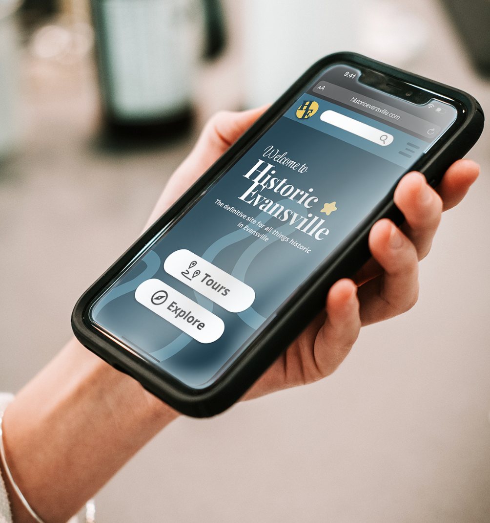
The City of Evansville exists on the bend of a river that is essential to the local history of the area from travel, commerce and disasters involving flooding. I chose to incorporate the iconic local shape of the river into the background of the design and toyed around with it being part of the updated logo.
The yellow in the logo represent the wheat and corn historically used in commerce of the area; while the blue represents the river and the path the wheat and corn took to be sold.
The style guide was developed to reflect the historic nature of the site redesign while adding a crisp modern look.
View a short video of the site in motion below